One Room Challenge: Week One

Hello Everyone! Today the One Room Challenge Spring edition officially starts! It’s been a minute since I’ve participated in the One Room Challenge, Spring of 2020 to be exact. Back in Spring 2020, I gave my Cottage She Shed a full makeover, I’m still in love will all the updates completed during the challenge.

The thing I love most about ORC is the timeline pushes you to get creative, think on your feet when your original design plans don't as planned, and, most importantly, finish your space. I also love following everyone's spaces as they come together in eight weeks. Trust me when your working on a project regardless of size for ORC challenge the eight weeks goes by so fast! Read more about my last One Room Challenge project here, from the beginning.

ONE ROOM CHALLENGE // THE PROCESS  

OCR is a bi-annual challenge taking place every Spring and Fall, ORC is hosted by Linda Weinstein of Calling it Home with media partner with Apartment Therapy, so its a kind of a big deal!

Every Wednesday for eight consecutive weeks, I will be sharing my progress on the blog and sharing lots behind the scenes details on Instagram Stories, please follow along on Instagram too! On Instagram stories, I’ll share details about the design process and taking everyone along with me as I shop of elements to bring my space together to create my design vision.

ABOUT KATRINA BLAIR

Welcome to my blog! Before sharing the space I'm tackling, here's a little about me. My name is Katrina. I live in Sacramento, California, in a small charming 1950's ranch house with my husband and our two sons and chocolate lab Oliver. I'm a lover or small old houses; old homes have that built-in charm.

I consider my style California Modern Casual, I love a mix of clean lines, paired with classic elements and a dash of mid-century vibe is a must in every room I design. On my blog, I share design ideas for small home dwellers, sharing how to maximize small spaces, along with DIY Projects and Design Inspiration inside and out.  

One Room Challenge Project // KITCHEN MAKEOVER

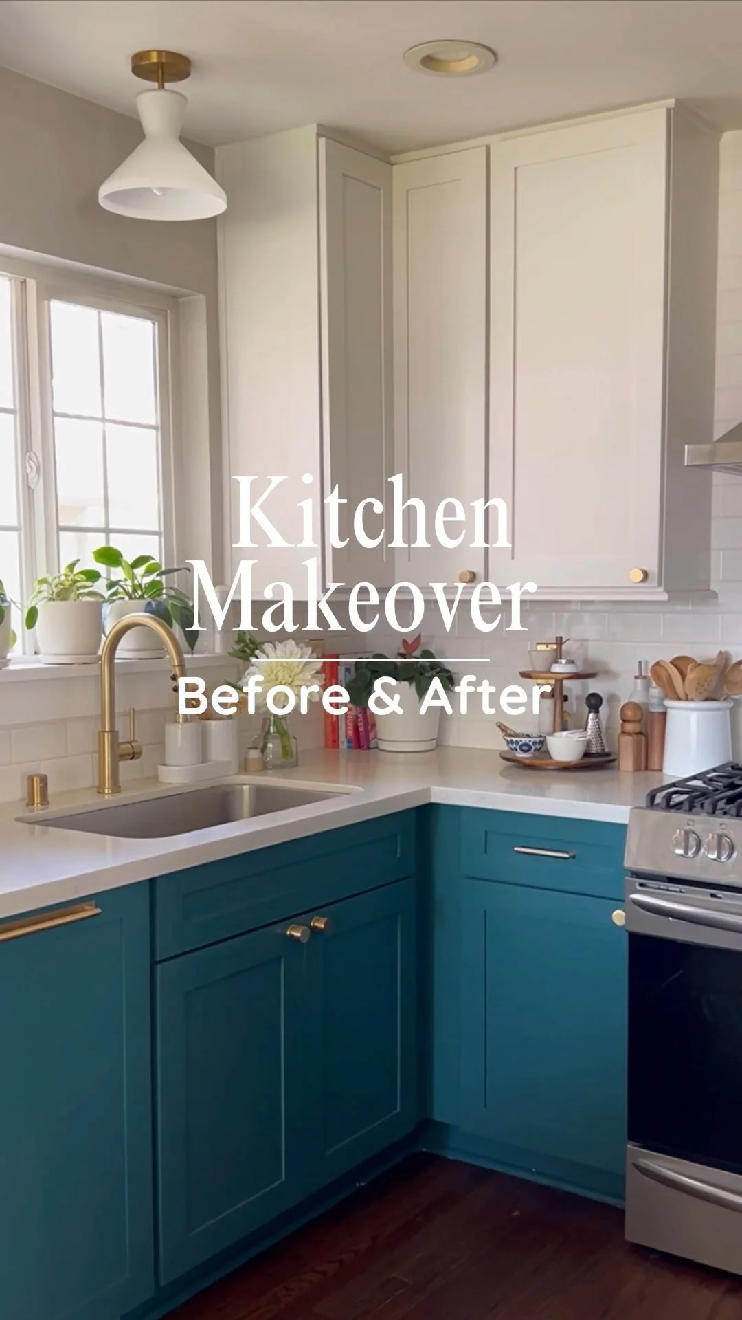
For the Spring One Room Challenge, I’m giving my kitchen a makeover! I’m so excited about this project and looking forward to giving our kitchen and update, while its not going to be a gut job, since our cabinets our 11 years old and good condition, but they can definitely use a new coat of paint!

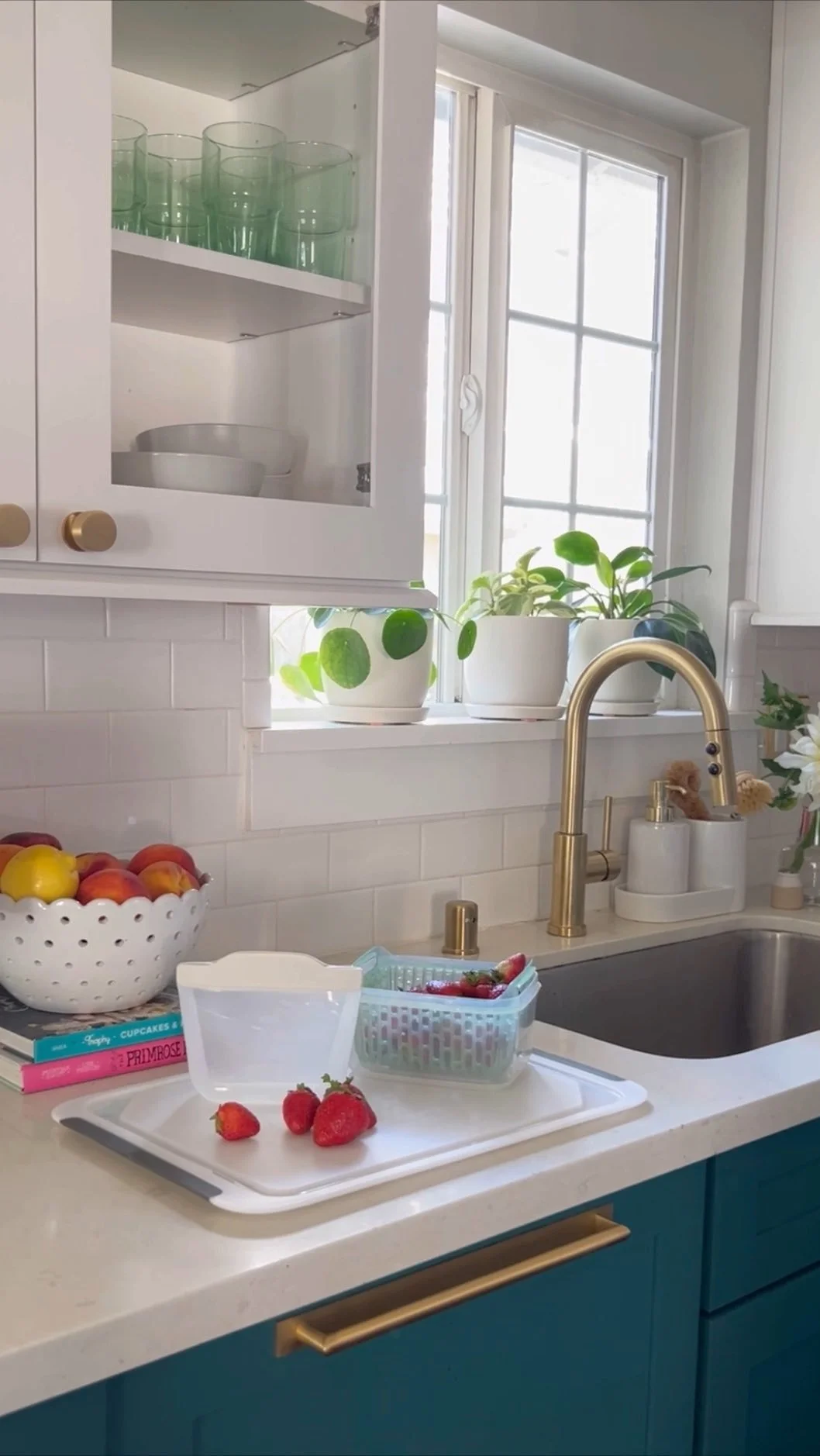
It’s still going to be a major update with new appliances, fixtures and hardware and paint! I’m most excited and nervous about the paint, I’m heading to a few paint stores this weekend to pick up paint color samples, sharing those deets on Instagram. Fortunately I love our kitchen layout and it fits of small space perfectly, in addition to design updates, I also want to make the interiors of the cabinets more organized and refresh kitchen ‘decor’ elements and get new cookware, pending budget! Here’s a look at our kitchen.

Week Two, I will share my design plan, I’m still getting a few pieces of my design solidified and can’t share in detail my design plans. In the meantime, please follow me on Instagram I will share all the behind the scenes details, the good and the bad! Can’t wait to hear your thoughts on the space I’m giving a makeover! I’m so excited to breathe new life into our kitchen!

One Room Challenge: Cottage Studio, The Reveal

Hello! I’m so excited today is reveal day and I can’t wait to show you around my One Room Challenge backyard cottage studio! My goal Eight Weeks ago, was to reclaim my creative space and transform it into a sun-lit creative hub. Oooh boy, this round of One Room Challenge has been a challenge, between COVID closing everything down, working FT, School & Childcare closures, juggling all the things in addition to a New Civil Rights Movement kicking off, they have been a lot of emotions behind the scenes.
BUT FIRST, a little about me. If this is your first time here, welcome to my blog! My name is Katrina. I live in Sacramento, California, in a small charming 1950's ranch house with my husband and our two sons and chocolate lab Oliver. I'm a lover or small old houses; old homes have that built-in charm. I consider my style California Modern Casual, I love a mix of clean lines, paired with classic elements and a dash of mid-century vibe is a must in every room I design. On my blog, I share design ideas for small home dwellers, sharing how to maximize small spaces, along with DIY Projects and Design Inspiration inside and out.  

One Room Challenge, Backyard Cottage Studio

Working my the backyard cottage has been a great creative outlet. Small spaces are my jam and this space has so many challenges that I had to workaround. The cottage is roughly 10x12 the size of a small bedroom and has so many features working against it, including low pitched ceilings, a center door opening into space, an old dated style skylight that gave off blinding white opaque light. 

Before kicking off Week One of the One Room Challenge, I decided to give myself a blank slate to design and boxed everything up and place it into storage. I’m so glad I did this, it allowed me to see the space with fresh eyes. 

Please check out the my One Room Challenge from the beginning: Week One, Week Two, Week Three, Week Four, Week Five & Six, Week Seven

Over the past 8 weeks, I’ve been in project mode, replacing the old skylight, replacing the old lumpy flooring, installing quarter round, laying a stone landing entry step, installing new lights inside and out and refreshing the cottage interior and exterior with paint and flowers and did I mentioned new sod? We installed new sod in our backyard while tackling our One Room Challenge to give our backyard cottage a beautiful backdrop. 

I want to pause really quick and thank Linda, the founder of One Room Challenge, and Organizing all the amazing sponsors to help make my vision of my backyard cottage come to life. Linda, thank you so much for asking me to be part of this round of One Room Challenge, I was so nervous to say yes and I’m so glad I did! Breathing new life into my backyard cottage has been a dream come true and I love how everything turned out!! Another big thank you to the Media Partner: Better Homes & Gardens. Here’s a quick reminder of where I started. I also want to thank my rockstar husband, Hasani for helping me tackle all the not so fun projects in my studio and laying over 900sq of sod to give me a pretty lawn and backdrop for my cottage studio, LOVE YOU!

Cottage Studio Exterior Before

As you can see, everything before was very overgrown. One of the front windows of the cottage was completely covered in bushes and vines and the yard was in terrible shape. The stone pathway was randomly placed in the yard and was also overgrown.

untitled-2.jpg

Cottage Studio Interior Before

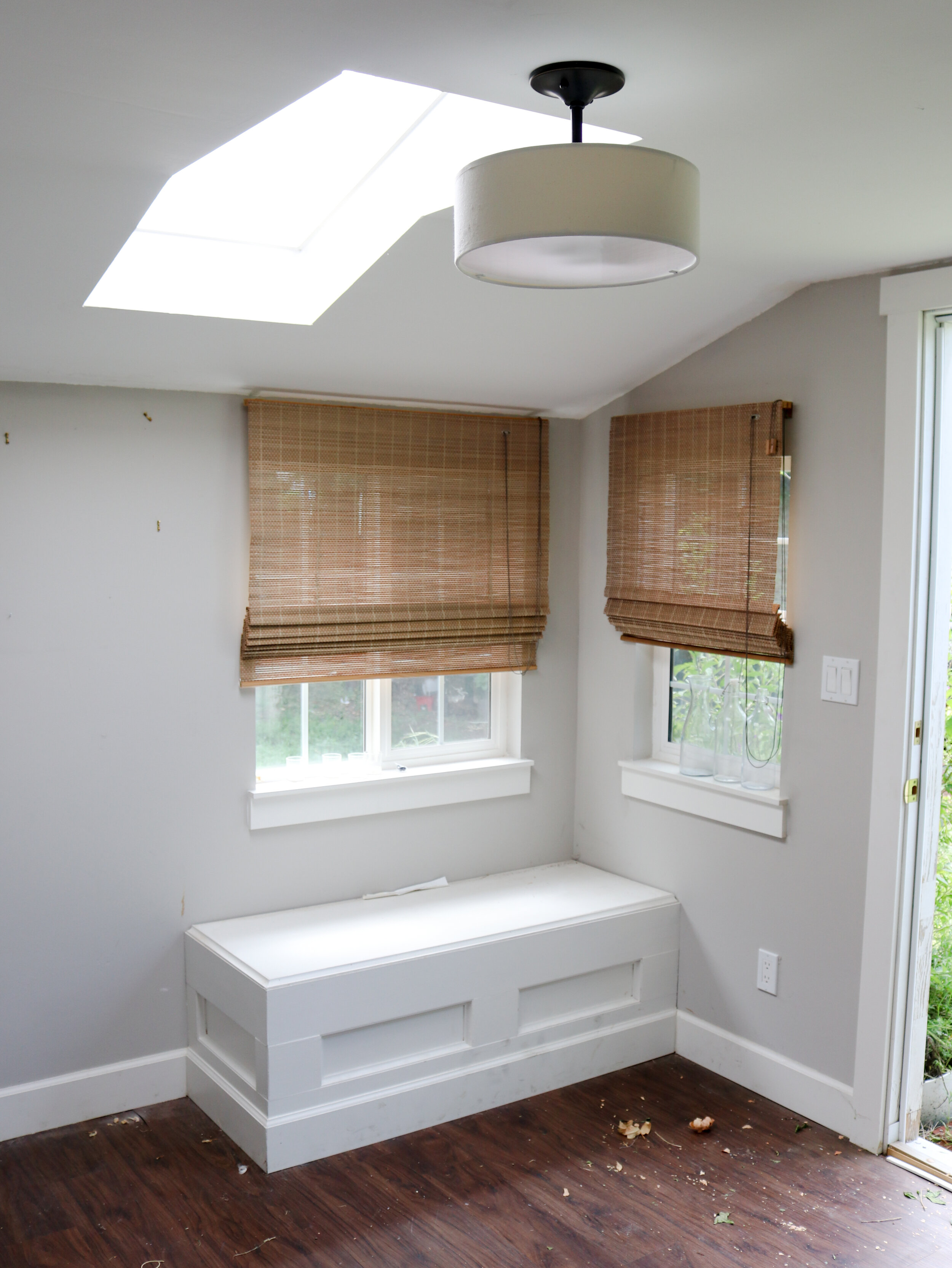
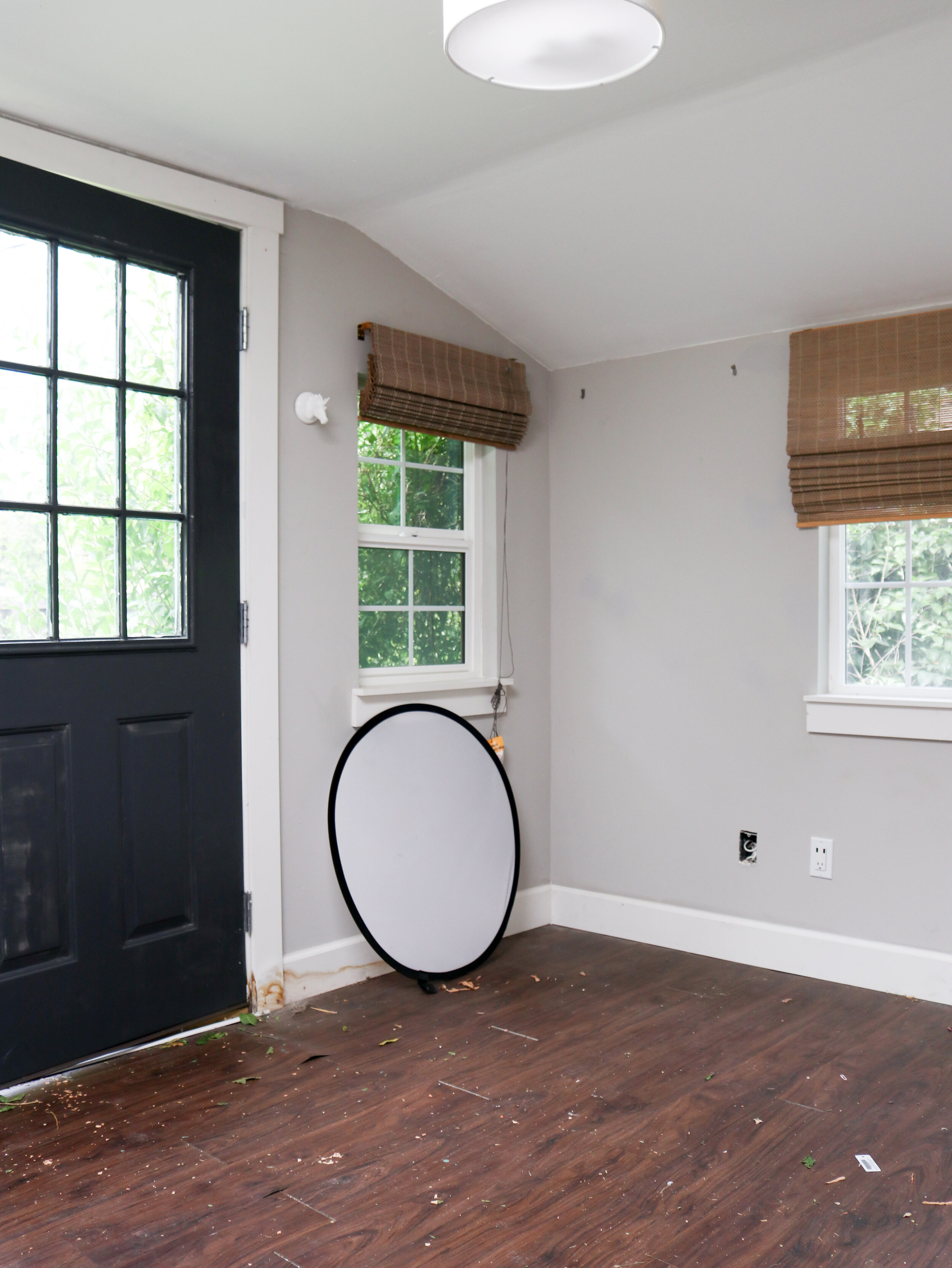
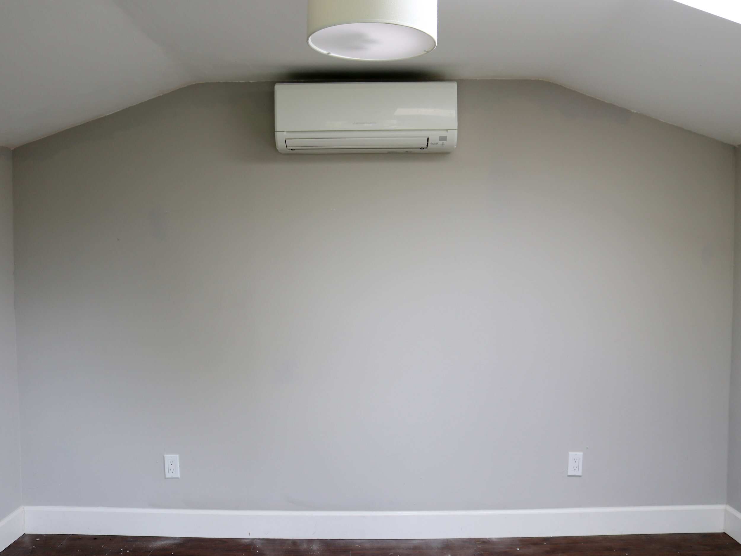
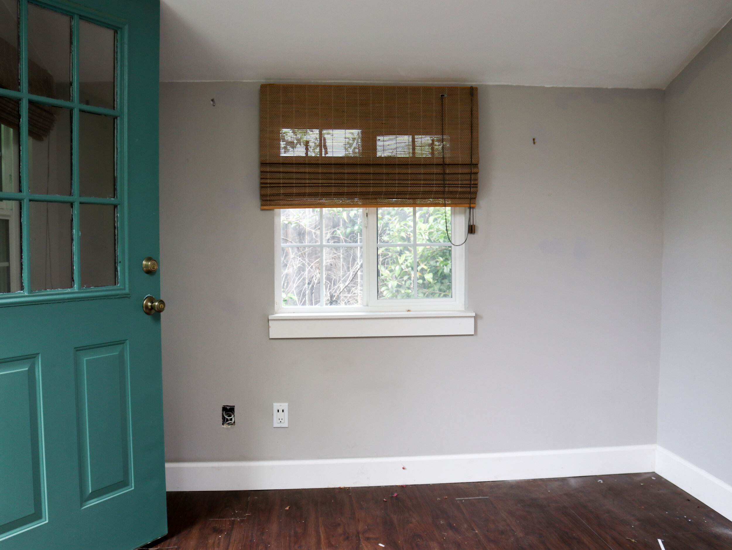
The cottage felt super dark and dreary, the vinly flooring was a hot mess and and lumpy

untitled-6.jpg
untitled-10.jpg
untitled-7.jpg

My Cottage Studio, After

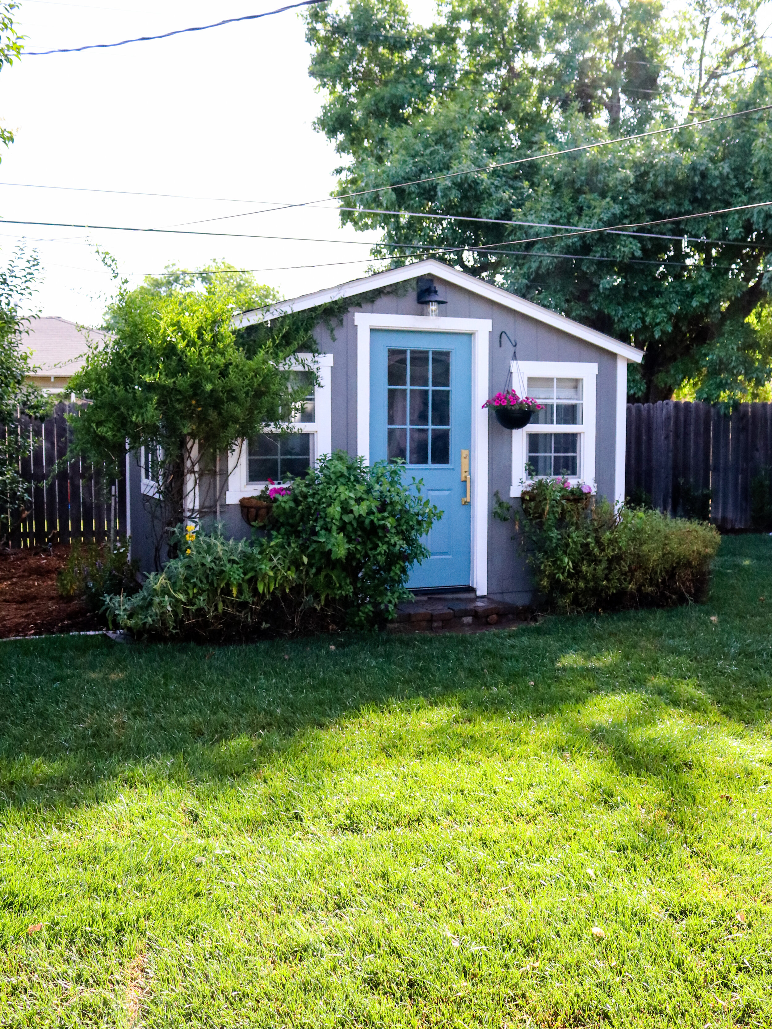
I’m so excited to welcome you inside, but I first want to share a few updated pictures of the exterior. Outside the cottage, I trimmed back all the overgrown hedges, and white potato vine and began training the vine to climb under the eves. Eventually, I’d love for the vines to fill out the roofline; I just love the look of vines grown on the side of houses. To give the door a fresh look, I painted the door Baritone, by Glidden its such a beautiful, by the second coat of paint on the door I was in love. The turquoise blue door looks so cute on the exterior and by happy accident, it coordinates with the interior.

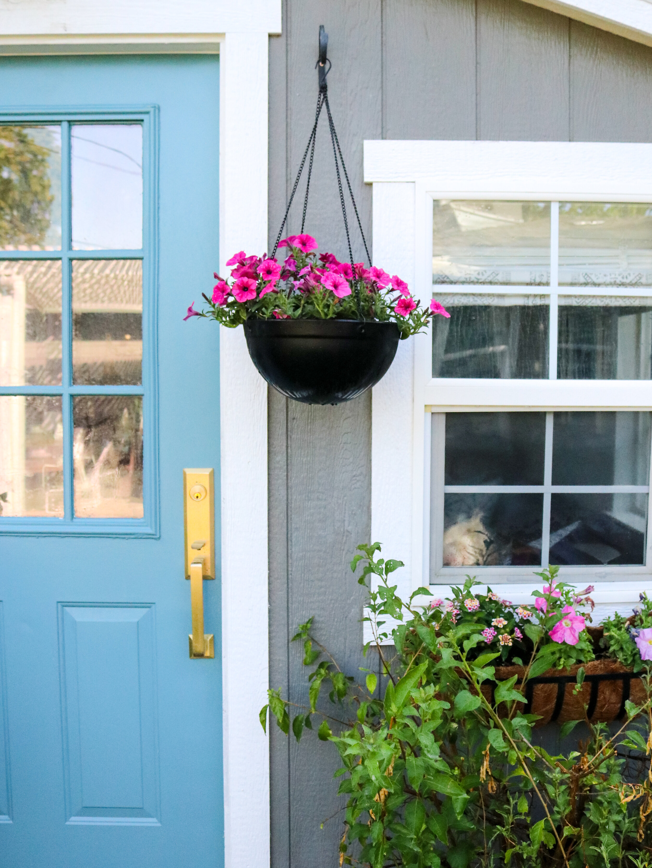
The new door hardware is from Emtek and its incredible, its substantial. For the door hardware, I selected the Transitional Hertigage Monolithic in the Satin Brass Finish, the inside lever is L-Squared Faucted. The hardware is incredible inside and out. I love how customizable the Emtek door hardware is, you can select the finish, and inside opening; either lever or knob. So many options! I love how amazing the door color and new hardware play off each other. I filled the existing window boxes with a mixture of flowers and added a simple hanging basket (sprayed paint black) outside the front door. I really wanted to update the light fixture above the door entry, and this little space on the pitched roofline is so tricky! I found the perfect exterior light at The Home Depot, the Westminster Outdoor Lantern and glass shade looks so good above the doorway.

photo credit: Katrina Blair

photo credit: Katrina Blair

SOURCES: Exterior Cottage Color // Pier by Behr, Door Color // Baritone by Glidden, Door Hardware // Transitional Hertigage Monolithic in the Satin Brass Finish Hanging Planter // Southern Patio Basket Window Boxes // Metal Window Box Planters

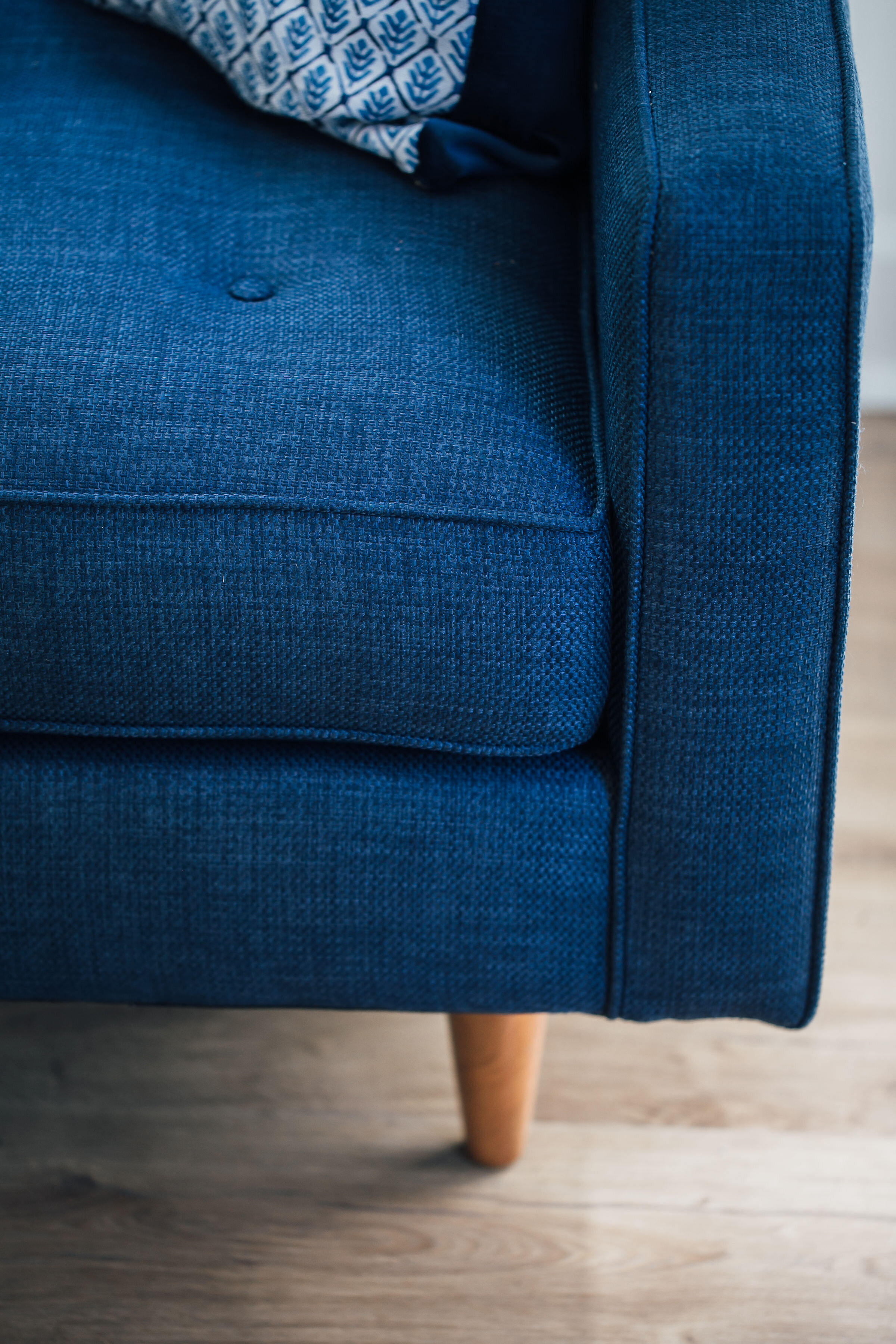
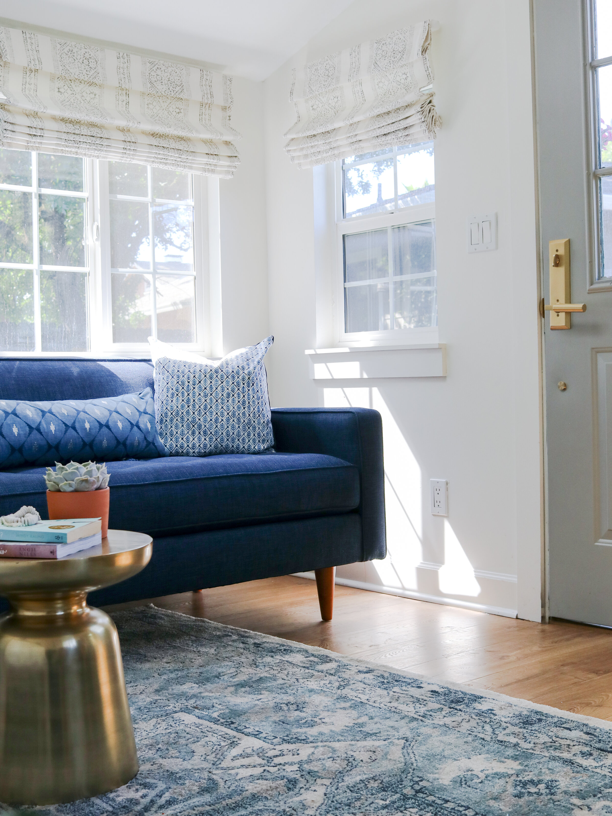
Welcome to my new creative hub!! My goal was to create a sunlit cottage, with mid-century vibes, natural elements, and a beautiful tone on tone colors. When you now walk into the cottage studio, you are greeted with beautiful Pergo Outlast+ flooring in Marigold Oak, form The Home Depot. The flooring helped elevate and ground the space, making this small 12x10 space feel much larger. I wanted the walls and low ceiling to recede and create a beautiful backdrop, the walls are paint Swiss Coffee by Behr and the trim is also Swiss Coffee in Gloss. A sofa was an absolute must for my cottage! Yes, sofas work perfectly in small spaces, it’s all about nailing the scale of the sofa to fit your space. The sofa is everything!! It was love at first sight when I came across the Monroe Sofa from APT2B, I wanted to add a punch of color in the space and I’m so so happy I went for it and selected the Navy fabric for the sofa. I’m in love with the Mid-Century vibes of the sofa, from the bench seat to the leggy profile I love it all. Most of all I love how the back of the sofa perfectly hits the bottom of the window, not blocking any light and making the sidewalls of the cottage feel taller. APT2B knows how to make a comfortable stylish sofa and make the sofa ordering process fun and stress-free! Having samples sent directly to my home helps take the guesswork out of buying such an important piece online.

ChristinaBestPhotography_KatrinaORC-2.jpg
photo credit: Katrina Blair

photo credit: Katrina Blair

Sources: Artwork: Lisbon Portugal , Gold Side Table

ChristinaBestPhotography_KatrinaORC-9.jpg

I love how much the view inside the cottage has changed! The view got a massive upgrade with the VELUX no leak Solar Powered “fresh air” Skylight. The skylights open and close with a remote or APP on your phone, allowing you to let fresh air in and trust me it’s amazing, not to worry the skylights come with a screen that doesn’t obscure the view. Looking out my skylight is like looking out a standard window, the view is crystal clear, I can now see the beautiful sky and let the fresh air inside. I’ll share more details about the VELUX skylights and installation process and much more in an upcoming blog post.

Another beautiful update you see when you walk into the cottage is the stunning semi-flush Alyssa light fixture in aged brass from Hudson Valley Lighting, I’ve had a crush on this light fixture for ages and I love how amazing it looks in the cottage. The beautiful brass floral stems on the light, just wow me, and the size of the light bulbs are incredible. When the lights are on at night time, they give off a beautiful vintage glow

ChristinaBestPhotography_KatrinaORC-5.jpg
photo credit: Katrina Blair

photo credit: Katrina Blair

I just love this view of the corner windows, they now work so perfectly together! The fully functional DIY Roman Shades make this corner of the cottage feel extra special. The fabric to make the Roman Shades is from Tosho Stripe Pewter, Tosho Stripe Pewter. The fabric is even better in person, I have a DIY Roman Shade Tutorial coming to the blog soon.

I painted the inside of the door, Downtown Grey by Behr. When it comes to small spaces, I love decorating tone on tone color, I found the perfect rug for the cottage at The Home Depot, the LaScala Rug 6x9 has all the beautiful shades of blue and looks amazing in here. I wanted the rug to fill the space but ran into a few clearance issues from the front door, the rug had to be shifted over to fit the room better, but thankfully it works. I love how plush the room is underfoot and all the pattern it brings into the cottage it pairs so perfectly with the flooring!

photo credit: Katrina Blair

photo credit: Katrina Blair

ChristinaBestPhotography_KatrinaORC-19.jpg

On the sofa, I wanted vibrant pillows, that would look amazing on the sofa and bring in texture and color. I found the most beautiful fabric for my sofa at Calico Corners, these pillows were a labor of love. I just love the pattern mix, from left to right: Magitha Indigo, Back of Pillow, Studio Velvet Midnight Enele 5 Pacific, and Klimit Gilding / Midnight

ChristinaBestPhotography_KatrinaORC-7.jpg

I love how my desk area turned! I love working in natural light and placed my desk under the window to give myself a view. Outside the window, I planted dahlias, saliva. One day I dream of seeing beautiful flowers right outside my window.

ChristinaBestPhotography_KatrinaORC-16.jpg

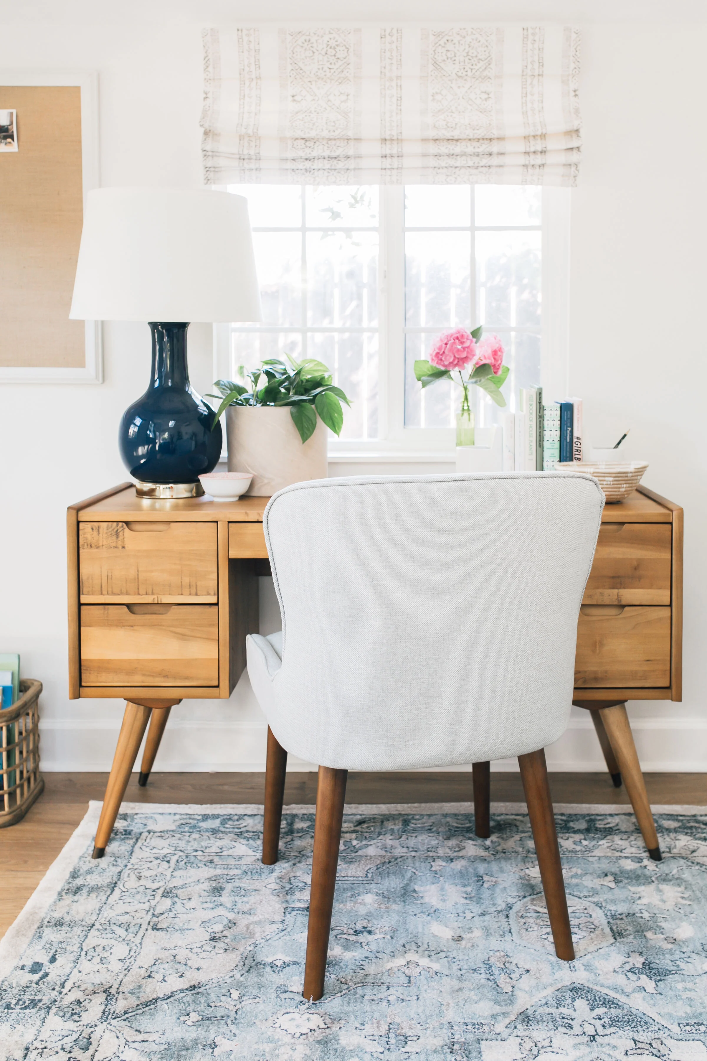
I love Mid Century modern style and found the perfect desk at Scandinavian Designs. I’m in love with the Bolig Desk, the style is amazing, I love the capped feet all the drawer space and beautiful wood tones. It feels like it was meant for my cottage. I found the perfect desk chair at World Market, the Zarah Petite Natural chair is actually a dining chair and works perfectly as either. Online they’re sold as a pair and I was able to buy one in-store. Again, look at how good the rug is!!! I shopped my home and found the perfect spot for this Navy Lamp, I love how it complements the space. I’m a secret lamp hoarder, I’ve realized over the years, one can never have too many lamps.

ChristinaBestPhotography_KatrinaORC-14.jpg
ChristinaBestPhotography_KatrinaORC-17.jpg
ChristinaBestPhotography_KatrinaORC-44.jpg
ChristinaBestPhotography_KatrinaORC-22.jpg

When it comes to looking for storage for a small office, think outside the box. I found on the perfect dining room sideboard at Scandinavian Designs for my cottage. In my cottage, Eptri Sideboard turns into a credenza and offers plenty of hidden storage with adjustable shelves inside. The top of the credenza gives me plenty of room on top to hold all the things. I love a layered mix when it comes to styling. Keeping with the Mid Century design style, I love so much, the Eptri just feels so so good in the cottage, I love the two-tone mix of natural wood plus white cabinet doors. all the Music is a must for me when I’m working the Harmony Radio from Overstock.com is perfect, I can listen to the radio or use the Bluetooth on my phone to access my playlist. Even in small spaces, I think having a variety of lights in a room helps to layer in lighting, I added a Retro Mid Century Table Lamp also from Overstock.com on my credenza.

ChristinaBestPhotography_KatrinaORC-21.jpg
ChristinaBestPhotography_KatrinaORC-27.jpg
ChristinaBestPhotography_KatrinaORC-25.jpg
ChristinaBestPhotography_KatrinaORC-12.jpg
photo credit: Katrina Blair

photo credit: Katrina Blair

I hope you enjoyed my Cottage Studio tour! The space feels so incredible and I love stepping inside. full confession, I’m not yet fully moved into my cottage and a few items meant for the space are still on the way! More blog posts will be coming soon, including my DIY Roman Shade Tutorial, VELUX Skylight blog-post and sharing all the details on how I’m keeping this small office nice and tidy.

ChristinaBestPhotography_KatrinaORC-36.jpg

HUGE SHOUT OUT

The real MVP’s of the One Room Challenge are my Design Collaboration partners for believing in me and being so supportive and making everything come together. big Thank you to my photographer Christina Best for knocking the pictures out of the park and getting everything back to me in a record time of for the reveal! Christina is amazing and has a lot of experience working with bloggers and knows what it takes to ‘get that shot’

Huge thank you to my ORC Design Collaboration Partners: APT2B, Calico Corners, Emtek Hardware, Handy Products, Hudson Valley Lighting, VELUX, Overstock.com Scandinavian Designs, and The Home Depot

PLEASE CHECK OUT MY FELLOW ONE ROOM CHALLENGE FEATURED DESIGNERS BELOW. You Won’t want to miss their reveals!

A Glass of Bovino | Beginning in the Middle | Beth Diana Smith | Clark + Aldine | Coco & Jack 

Deeply Southern HomeDesign Maze | Dwell by Cheryl | Erika Ward | Home Made by Carmona 

House of Hipsters | Hunted Interior | Kandrac & Kole | Kate Pearce | Katrina Blair | Liz Kamarul 

Veneer DesignsRambling Renovators | Renovation Husbands | Studio Plumb | Media BH&G 

SpringORC-2020.png
iwh3PswQ.png


I Wanna Hear from You, What Do You Think??

I’d love to hear your thoughts!! What do you think our my Cottage Studio One Room Challenge, do you love it as much as I do?? Sound off below! And let me know if you have any questions.