A few months ago, I updated our living room light fixture. Our new living room like looks and feels so good! I’ve noticed over the years, sometimes the smallest updates have the most impact! While looking for the new living light, I stumbled across the perfect light fixture for our dining room. I’m going to be completely honest, the old light fixture we had a was perfectly fine, just a simple drum shade and I’m a huge fan of that lighting style. However, when I spotted this light, I knew it was meant to be a was a must!! Believe it or not, I found both of these lights on Amazon! Even better both lights were under $ 150 each! But first, here’s a reminder of how our dining room with the old light fixture.
Dining Room Light Before
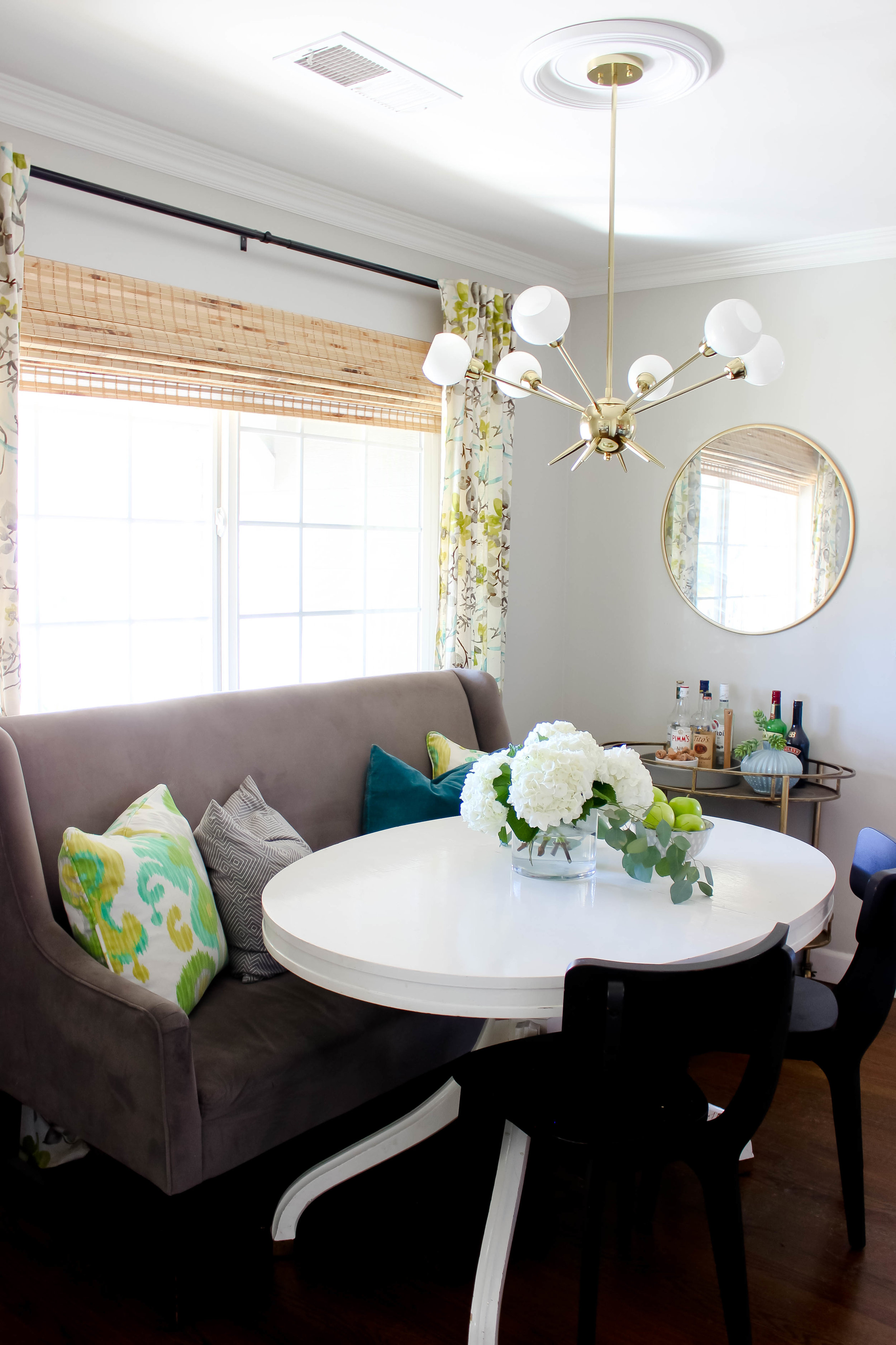
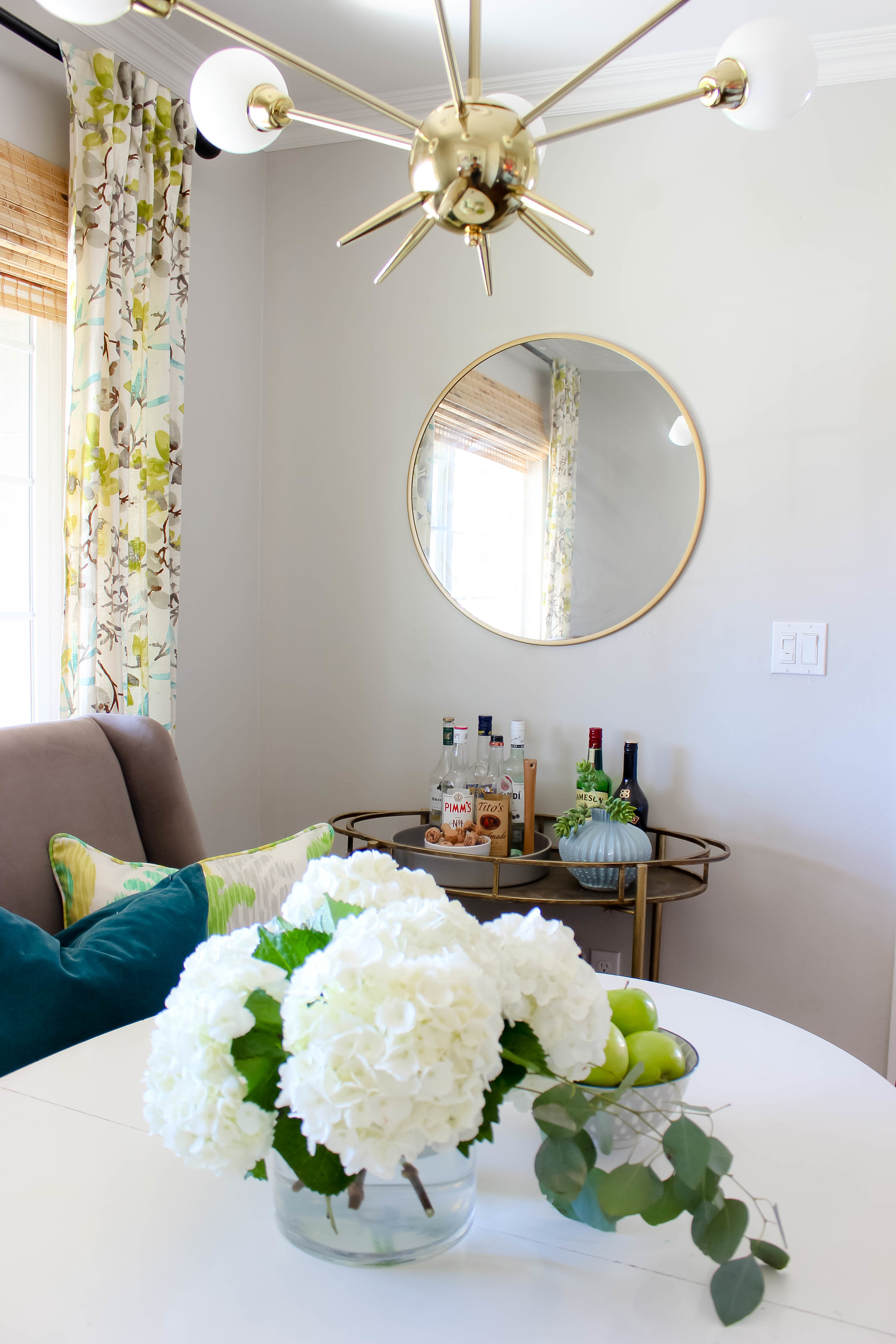
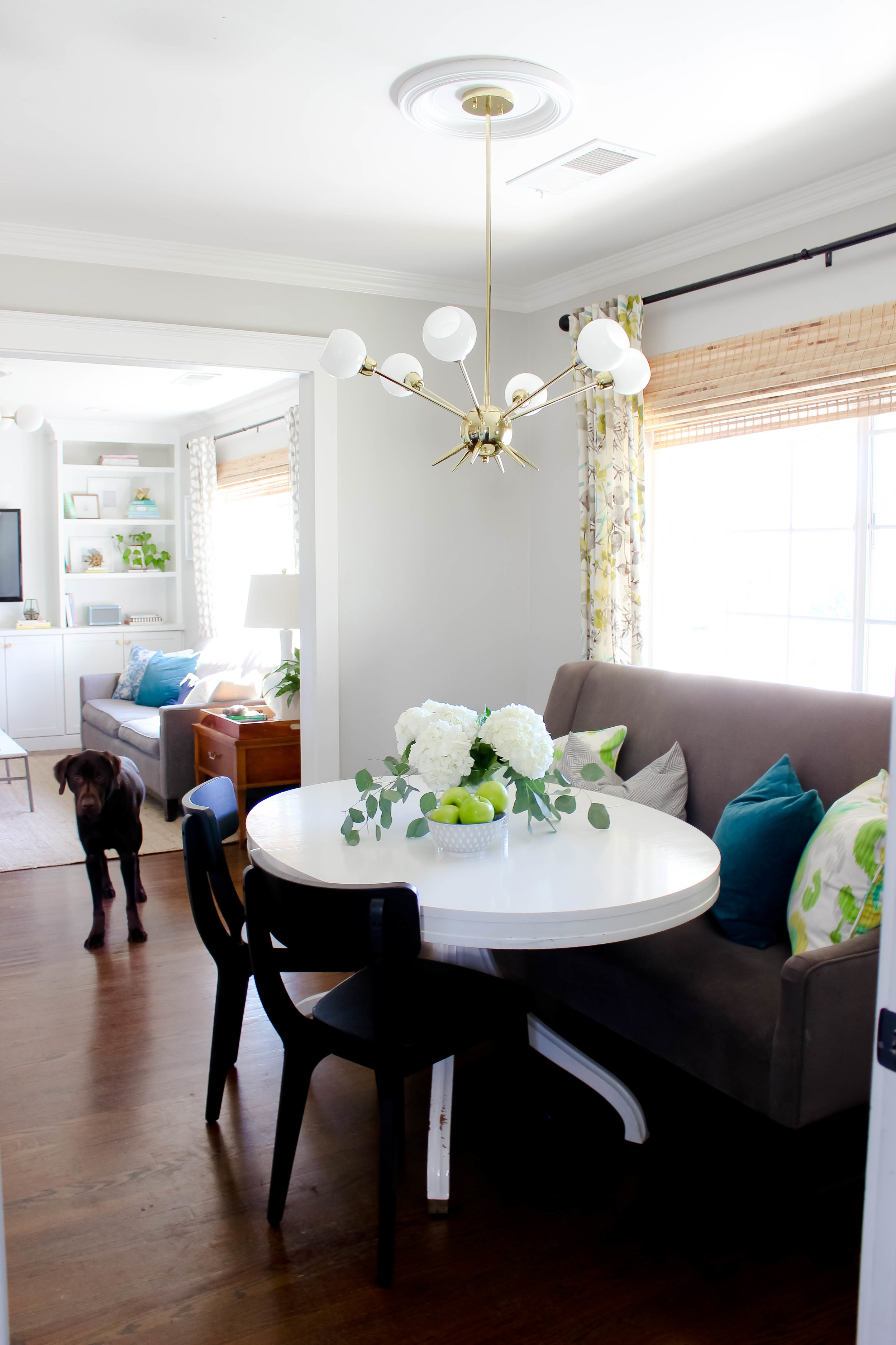
This is our dining room now, so much better right! For our dining room, I went with a six light Sputnik Vintage pendant, I love this light it's so pretty, the arms can be positioned either up or down. Since we have 8-feet ceilings, I opted to use two down-rods with the arm lights placed in the up position. I love how both the Sputnik Vintage pendant in my dining room pairs with the Grammercy Light Pendant in my living room. Both of the lights compliment each other a give a nod to my houses 1950’s Mid Century Modern roots.
Dining Room Light Now
The light fixture came in several pieces and as a huge pain in the but to put together, but once it was it was totally worth it. I used simple non-LED chandelier style lights bulbs and I’m happy to report the lighting in my dining room is bright and even. We have this light fixture on a dimmer switch, which really all center overhead light fixtures should be in dimmers.
To give the light more presence in our dining room, I added a ceiling medallion. They’re simple and affordable and adds visual interest. I used the same simple ceiling medallion I used in my living room. I love cohesive my living room and dining room lights are, they both add impact, don’t blend in the background and give off those MCM vibes, I love so much.
Get The Look
I love how this dining room light update turned out, and I see a few more changes happening in here of the next few months. Namely new artwork, new drapes and I’m toying with the idea of replacing our freestanding banquette seating with a built-in option that includes hidden storage.
What do you think of our new dining room light? Doesn’t it feel right at home within my 1950’s rancher?


