Our Freshly Painted Home

Our house is painted and its lovely, like really lovely! I did a drive by before getting out, totally wanted see our house from all angles. It looks amazing at all angles even with it been completely gated in and with a heap of junk in the front yard and my poor sod that's tore up and dead (cue the tears, you all know I love pretty grass & well kept lawns) Back to our home, after stopping in Home Depot we found the perfect color for our home Behr Pier in satin finish, which our painter color matched to Sherwin Williams (his preferred paint brand) read more choosing the color

here

. We had the painter all the trim and end board on our exterior a shade of white to match our seamless gutters. 

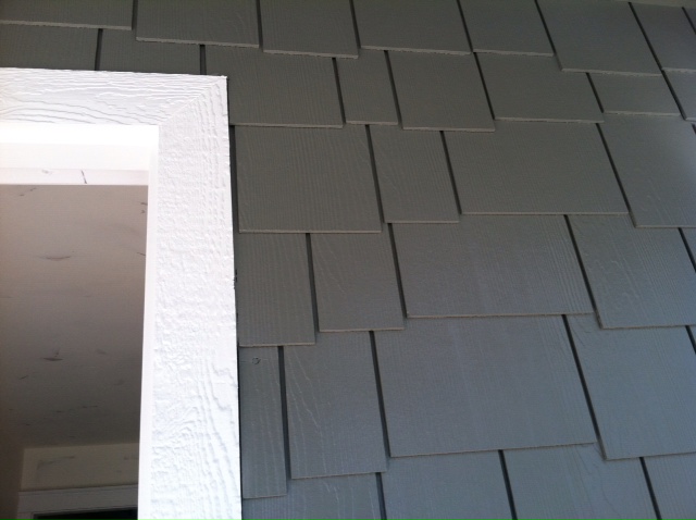
We absolutely love how the house looks painted in Pier, the color is rich and such a pretty shade of medium grey, but not to dark grey. In the pictures below the color looks a little darker than it appears in person. As you can imagine with all the construction and debris at our house it's hard to get a really good full house shot at the moment. Instead of sharing a bunch of full shots, I'm sharing some good detail shots of our home. I'll share more full shots in the future. I love how everything is flowing together from the

Hardie Staggered Shingle

s,

Hardie Lap siding

, original brick, new window with grids and craftsman door from

Homewood Lumber

 it's all working together which is such a good feeling. I'm so thrilled all our ideas & selections are working, especially since before the fire we were used to doing updates on our home little by little its been scary & exciting making so many decision all at one time. 
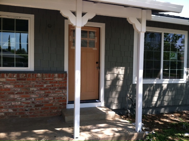
The very front of the house staggered shingles ties in seamlessly with the lap siding. We decided to add the staggered shingles to the very front of the house to break up all the lines of the lap siding.
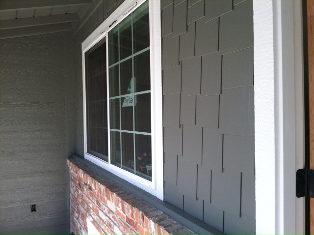
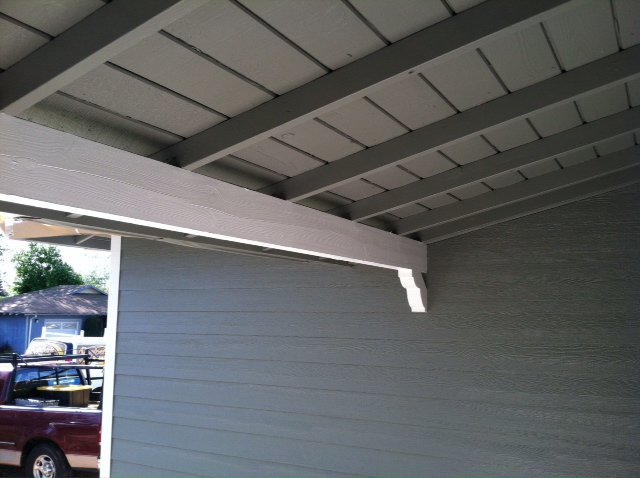
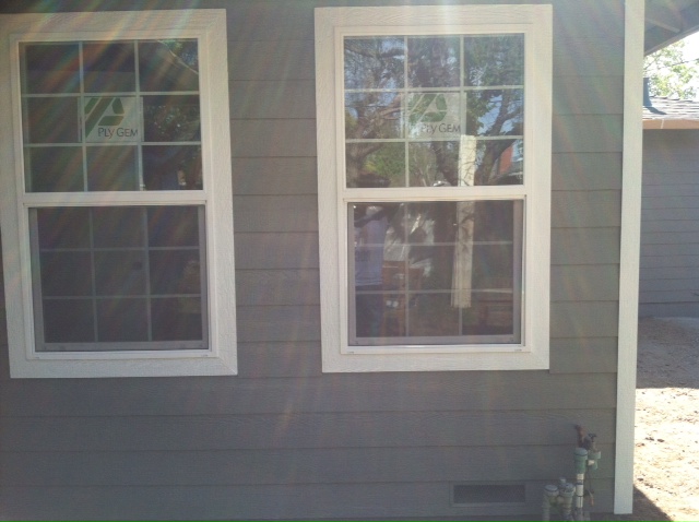
Avery's new twin windows
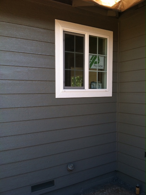
Our kitchen window, I keep picturing a pretty flower box under he window. 
Over the weekend, Hasani and I looked at many paint colors for our front door. If you follow me on a

Instagram

, then you already know I was having a tough time deciding on what color to paint our front door! Big huge heartfelt thank to everyone who left a comment letting me know which colors they loved! I really appreciate your input. If your on Instagram follow me @mrsclh I'm having so much fun sharing daily pictures of my life with everyone and getting to know people & readers of my blog and discovering so many amazing 'new to me bloggers' which is so great, love having a little 'insta-community.' If your not on Instagram yet, you should be, lol. 

Once our front door is painted, I'll share pictures crossing my fingers it looks amazing. In the meantime you can read more about our front door color inspiration

here

.

What do you think of our freshly painted house? Are you working on any painting projects around your house. 

Front Door Color Inspiration

I had had to share house updates every Friday, but now that our home is moving full speed ahead during the re-building process, I'll be doing updates throughout the week. Yesterday I shared our

new craftsman style front door

we picked out for our house along with the paint color we decided to paint our homes exterior with on Monday. This weekend we need to pick out a front door color, our old front door was a fun shade of red called Posh Red (read more about the color

here

) but this time we around we decided to change things up and go in a new direction. I've been dreaming of a shade of aqua or a shade of green chartreuse to be exact. I think either shade depending on the shade, would look so pretty next to our now deeper grey house. I plan on sharing updated pictures of our house on Monday. 

As a reminder our house is a medium deep grey with white trim, so part of me thinks our front door should be a suitable shade of aqua. The inspiration pictures be having me thinking it good work and still give us a pop of color while walking up to our front door without hitting you over the head with color.

Blue Aqua Shade

(via

forum.homeone.com.au

)

Picture our siding darker.....the aqua turquoise shade could really 

(via

Pinterest

)

(via

Pinterest

)

This pretty deep aqua shade is so pretty! I love how the color pops against the white trim & deep green house exterior. 

(via

Pinterest

)

I love this warm grey shade of aqua, looks so pretty on

Caitlin Creer Interiors

. She painted her front door Benjamin Moore Cloudy Sky. 

via

Caitlyn Creer

Green Chartreuse Shade

The chartreuse shade front dolor maybe not be for everyone, but for some reason I'm really drawn to the color and think it would look so pretty as our front door color. My sister thinks its an awful color for a front door! But I know finding the right shade of chartreuse will be hard, I don't want to venture into the too bright and in your face category. I want to stay in the that's pretty and cheerful instead. The doors below have caught my eye. 

(via

www.BHG.com

Same door as above, the color below maybe closer to the actual color. I like the shade above a little better. 

(via

www.bhg.com

)

This dark grey color really helps me picture how a shade of chartreuse green would look on our home, it could work! The front of this house is more formal than ours and as more white around he doorway will, but still helps me imagine it. 

(via

Pinterest

)

(via

Pinterest

)

I've noticed the front door colors I'm most drawn to are the same colors we are using inside our home: grays, aqua to deep turquoise and chartreuse. Below our

peacock blues lamps

I found for a steal at a local consignment shop & fabric we are using as drapes & pillows. 

What ever color we end up choosing for our front door it will have to 'play nice' with our original brick on our porch. This weekend Hasani & I have some serious homework we have to get done.

What do you think are you on Team Aqua? or Team Chartreuse?