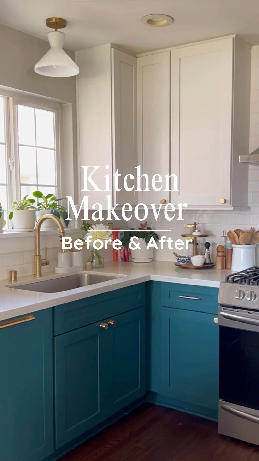
As you know, I'm in the process of updating my Home Tour page. Every Friday, I'm sharing my home room by room and then updating my Home Tour page. It's a fun way to share my home both present and past in one post. This week on my blog, I'm sharing my beloved kitchen. Oh how I love my kitchen, I didn't always love it. However, I knew when we bought our home in 2009 that our kitchen had good bones and I saw the potential for it to look & feel amazing. This is a long post friends, so grab a cup of coffee and let's do it!
Below is a picture of our kitchen about a year after we moved into our home. Funny enough in the picture below, it actually looks better than the day we bought it! We removed the old cracked tile that previous owners installed over laminate (who does that?) and installed laminate flooring to create a cohesive look with our existing 1950's hardwood floors. In the Summer of 2012, we started the renovation process of our kitchen. Here's a quick rundown: we ripped out the old dated tile counters and backslash, removed the cabinets above our stove to make room fore a stainless steal hood, replaced the counters with LG HI-Macs, installed a new sink & faucet and replaced our stove with a new stainless steal gas range. Read more about our new counters & kitchen updates we completed in 2012 here.
A couple of days after our new counters & new range where installed, our house was badly damaged in a house fire, it still breaks my heart even typing this. A fire broke out in the house next door, and then spread to our house via shared fence. I was devastated having lost 90% of our belongs and living in hotel for weeks and then a rental for a year, but determined to rebuild a house that we loved even more. I threw myself in the the design process or rebuilding our home. Our kitchen was torn down the studs, from the ceiling the floors and ripped completely apart. At one point during the rebuilding you could see though our entire house just be standing at the front door.
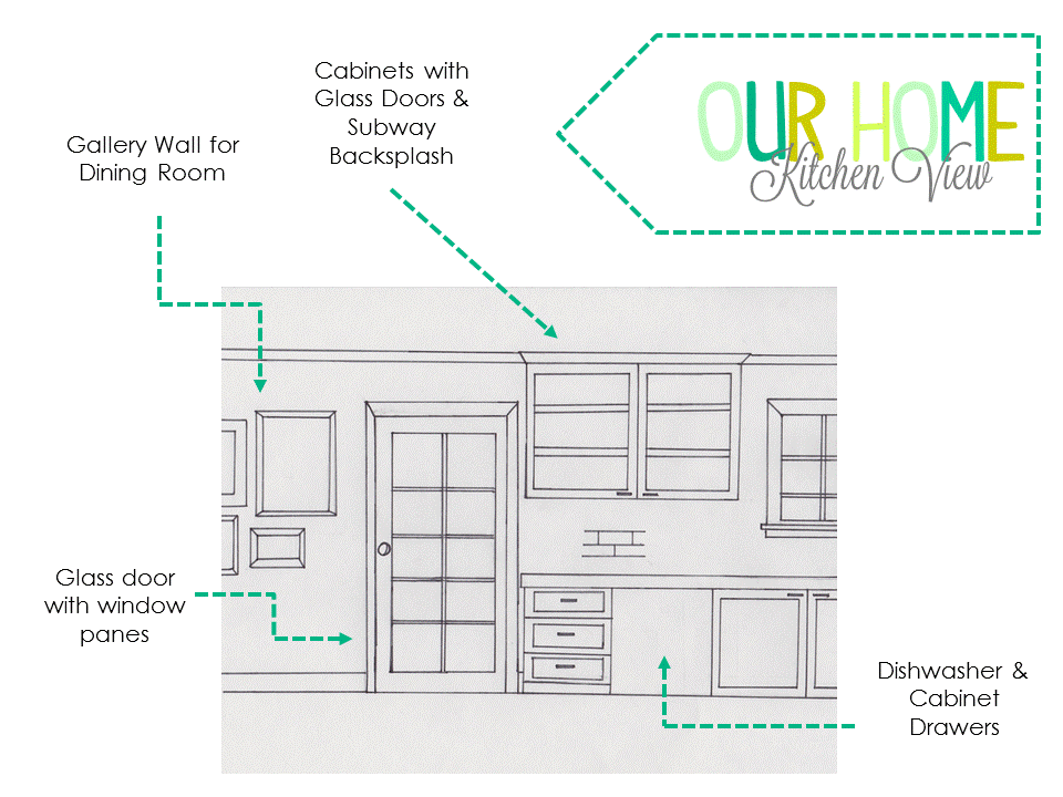
I drew this sketch below, of how I wanted our new kitchen to look. Its still amazes me, that the drawing became a reality. Here's a list of what I envisioned for our kitchen.
- French Glass door leading to Laundry Room / Mudroom addition
- Cabinets all the way to the ceiling (for better storage + makes the kitchen feel larger)
- Classic Subway tile back splash
- Cabinets with Glass Front Doors next to our kitchen window
- Gallery Wall in the Dining Room (see here)
- Floating Shelves
- Built-in Fridge.
- More Storage!
- Built-in range
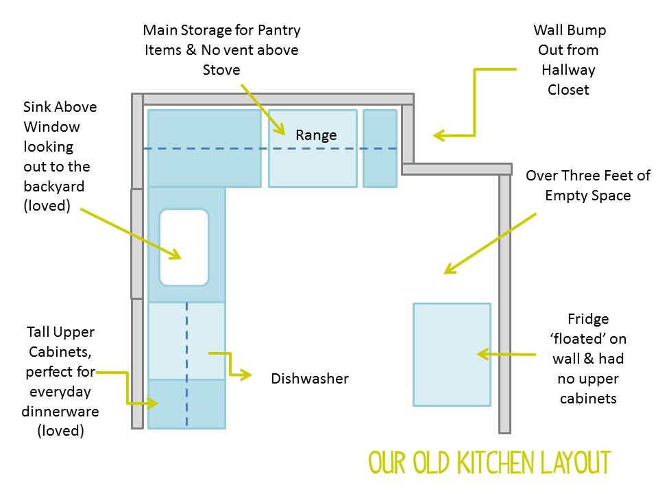
Below is a drawing I made of our old kitchen layout. Our old kitchen floor plan, made no sense to me whatsoever. A huge section of kitchen was taken up by a hall closet, by removing the hall closet that just stored junk, our kitchen & bathroom gained extra sq feet. Which is critical when you have a small home,every single inch counts. Removing the closet, allowed our kitchen to be symmetrical on both sides of the range. In addition, I hated that our fridge 'floated' on an empty wall and had no storage above. Another example of wasted storage + it look awful.
I dreamed up the new floor plan below, to incorporate all the design elements I wanted in our kitchen. I love our kitchen floor plan now, its a classic U Shape kitchen and has a fantastic working triangle! My kitchen is not big at all, in fact its barely 10 feet wide! However, with smart design choices my kitchen feels like the perfect small space kitchen well suite my 1950's rancher. On the plus side my kitchen FEELS larger than when we first bought our home.
Below is a picture of our kitchen a few months before moving back in. I used to look forward to getting off work each day and driving up out our home and taking a peak inside. It was a long stressful year of dealing with the insurance company, meeting with contractors (A LOT!), sources materials, going over the budget with a fine tooth comb and endlessly discussing every single detail of our home down to the light switch placement. Honestly, construction & floor plans in my DNA as a kid for fun I would draw my own floor plans and rearrange my moms living room without asking if it was ok! lol. When I would pull up to our home and see progress all the stress would melt away, my heart was filled with so much happiness, I get emotional even thinking about it now.
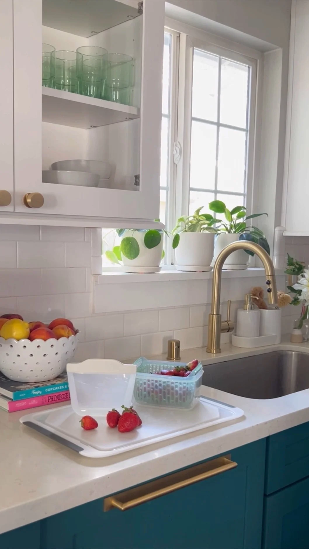
Below is the rest of my kitchen tour! There's those pretty glass upper cabinets that go all the way to the ceiling and the classic subway tile.
Here's a good picture of my kitchen straight on, on the other wall is our dining room (eat-in kitchen) This time around we had hardwood floors laid in our kitchen that are an exact match to our excising 1950's hardwood floors, seriously you can even tell where the old hardwoods and new begin & end. I wouldn't recommend hardwood floors for everyone, however I love having continuous flooring throughout our house.
In between our dining room and kitchen is the french door leading to our laundry room / mudroom. I'm so thrilled I went with my gut and didn't place a heavy solid door there. I know light from the laundry room flooding into the kitchen and dining room would look so good.
Below are the floating shelves that rest in between the cabinets and builtin fridge.
I love my kitchen, and it makes making dinner for my family and cleaning up so much fun! Kitchen Sources below
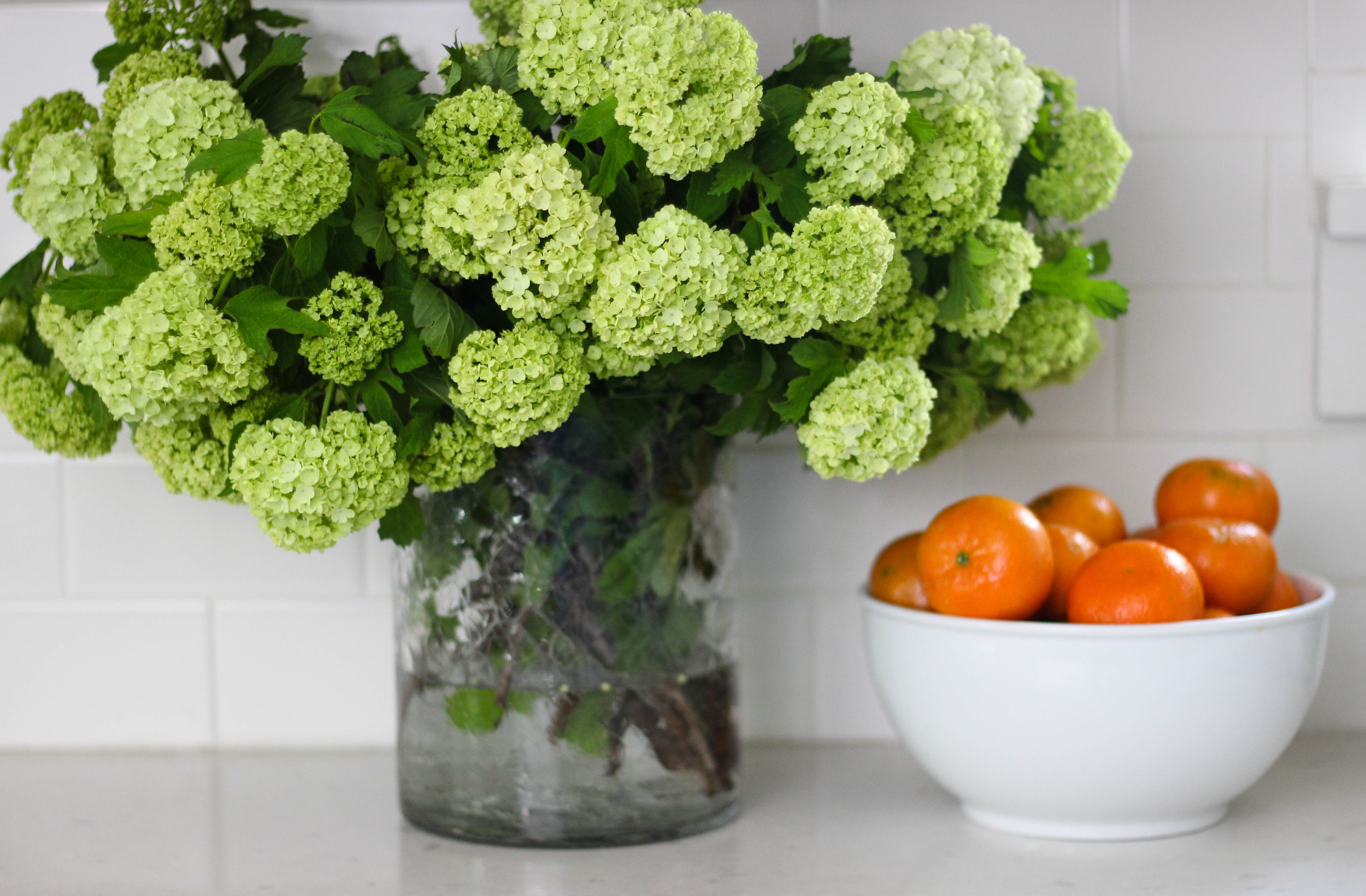
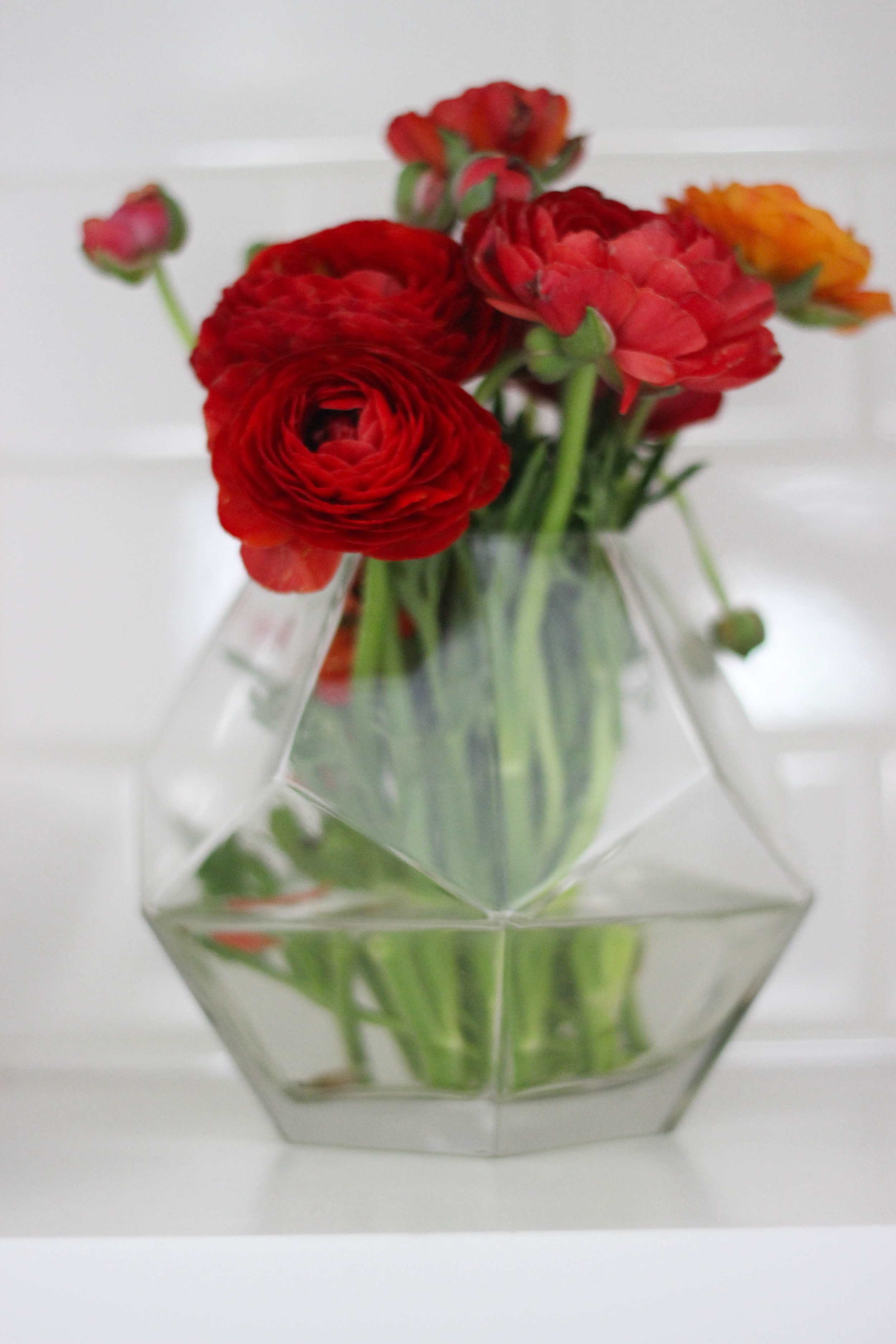
Appliances: Frigidaire Professional // Stainless Steal Range Hood: 30 inch Range Hood // Cabinets: Wellborn Cabinets // Roman Shade: DIY No Sew Roman Shade Fabric Monarch Trellis // Dishes: White Coupe Everyday Dishes // Large Vase: Crackle Vase // Large Bowl: Ikat Bowl // Animal Planter Similar: Cat Planter // Electric Tea Kettle: Ikat Tea Kettle (we use it daily! // Espresso Make Similar: Nespresso Pixie // Desert Cookbooks: Martha Stewart Cupcakes, Trophy Cupcakes & Primrose Bakery // Cookie Jar: Owl Cookie Jar // Light Fixture: Glass Pendant Lighting
If you have any questions about anything in my kitchen or the design process, please feel free to ask away! I hope you've enjoyed my kitchen tour.


