Best Way to Print Instagram Photos

By far my favorite social media app on my phone is Instagram. Its fun to scroll the gram and see what friends, bloggers and brands are up to daily. It's also fun to sharing daily glimpses what I'm up to and engage with my #InstaSquad. I'm still getting used to using IG Stories, which is like SnapChat, which I don't have, but those deer filters look like a blast! Above all its fun to be inspired by like-minded people. I've been using Instagram for a while, and have been wanting to find an easy creative way to print my photos. 

We have a mini FujiFlim Instax camera which is fun to use when your out and about, I just adore the retro look on the pictures. I wanted to find a way to print my Instagram pictures and give them that same retro vibe. 

After searching high and low, I found a fantastic company called Square Snaps, that lets you print your favorite Instagram pictures. Square Snaps has a few Polaroid print options: the Classic Vintage 3.5x4 and the mini 2.6x3. The process was super simple and fast, I created a account with Square Snaps and allowed them to access my Instagram account, then selected the prints and placed me order. The company is based in the UK, I placed my order on Sat evening and my prints arrived on Thursday, the shipped option I choose also included a DSL tracking number. I opted for the mini Polaroid prints, which are just the perfect size. Below is a closer look. 

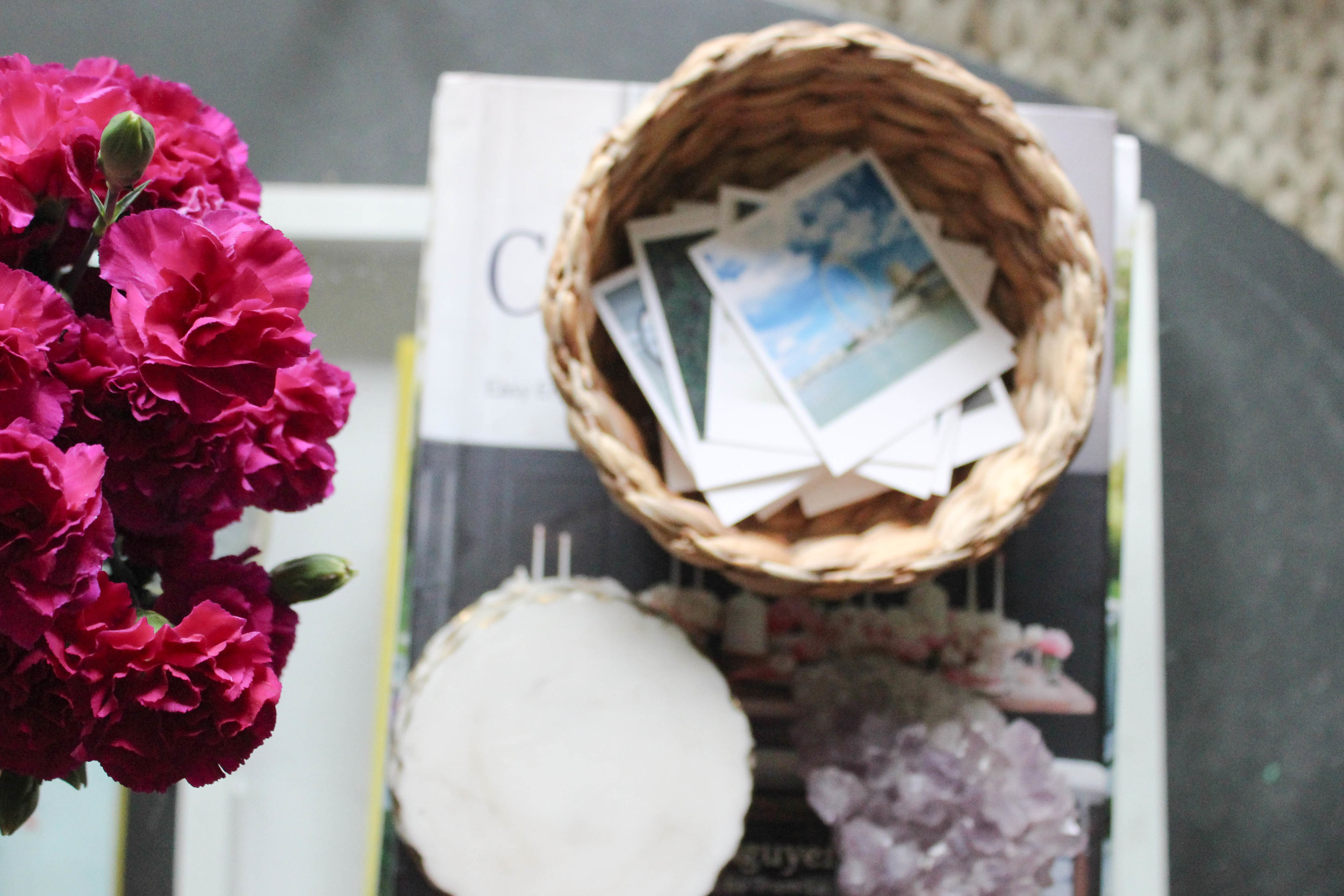
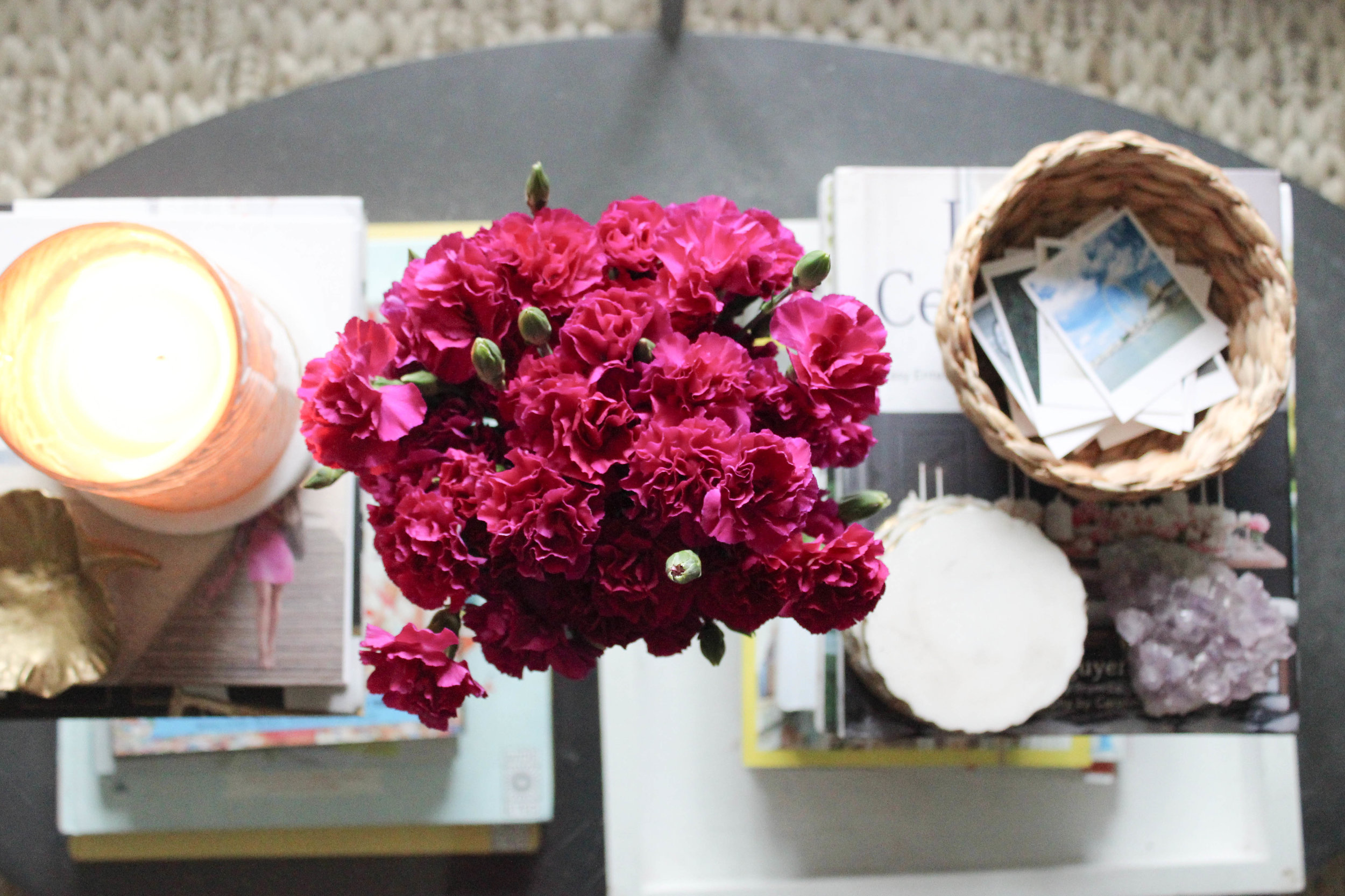
I have a little basket on my coffee table that I placed a several IG Polaroids in, its a fun way to see the picture and remember the story behind the photo. Plus having several within view also makes it fun for friends to look though. The photos prints are nice quality for such a bargain print and each photo is super thick. I love being able to hold the memory that I captured right in my hand. 

On my Instagram, I share a lot of interior photos or my home along with life sprinkled in, for the pictures I choose to have printed I choose a similar mix. 

20161029-IMG_3321.jpg

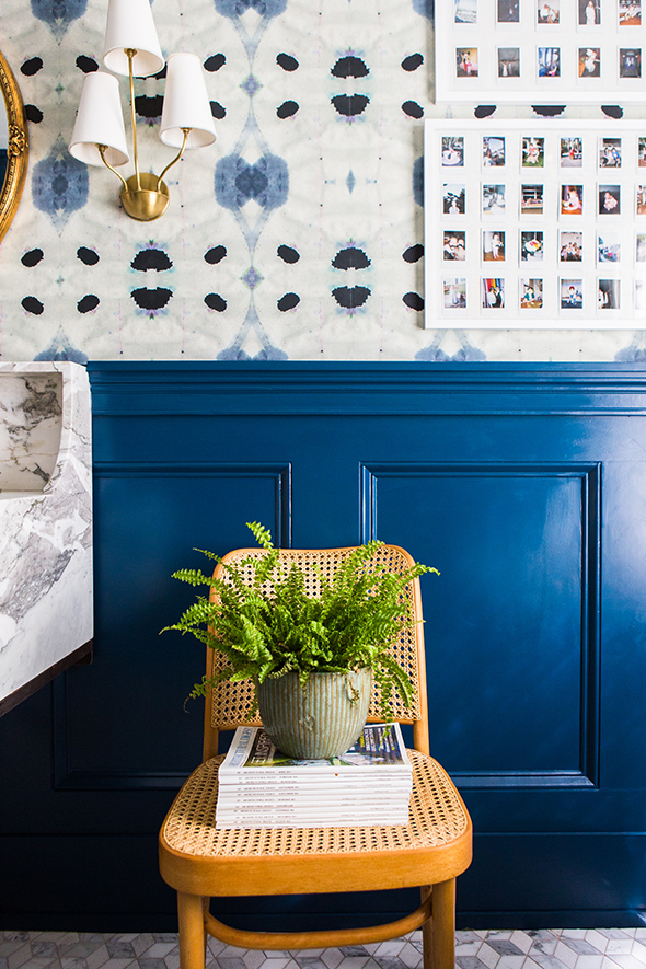
I plan to frame some of the Instagram Polaroid prints into a collage, I love how Jenny from Little Green Notebook framed her mini Instax Polaroid photos, they look so cute in her bathroom. I'm so excited to tackle the a collage of pictures and hang them up. In addition, these IG Polaroids would look fantastic pinned on an inspiration board or framed on a nightstand. So many possibilities. 

I used to love printing my photos, but for the past few years, I've been so bad about taking the time have photos printed. Go forward using Square Snaps is my favorite way to print photos double plus, I have the option to link to my Instagram again or upload pictures from my computer! Cheers to fun way to print memories and give them a retro vibe. Follow me on IG @ChicLittleHouse

How do you print your Instagram photos? Do you also love the look of Polaroid style pictures? 

9 Reasons I Love Blogging in Square Space

Hello friends! One of my favorite types of blog posts to read are ones that share the behind the blog details: how bloggers take photos, prepare a blog post, how they grow their following etc. I just love learning from others and its fun to get another bloggers prospective on what they do and how they do it & why. 

Earlier this year, I moved my blog from the Blogger Platform to Square Space, which as so thrilling and scary! I've been on the Blogger Platform since Day 1 and felt comfortable there, but comfort can sometimes feel stagnate and limiting. I really wanted the ability to have more creative control of my blog and not have to rely completely on blog designer to make small changes. I'm so not a HTML code person, I love that I'm able to make my own updates, organize my content, create landing pages and much more now that I'm on a new platform without having to know HTML. 

Since taking the jump to Square Space, I've been asked several times by my blogging friends how I like it, I honestly love it. After getting a boost of confidence from my friend Lauren of Color Hug to make the jump to Square Space, I choose my template and designed my blog, moved all my old content from Blogger to Square Space and then got to work. I've learned so much since moving from Blogger to Square Space, it boggles my mind that I stayed on the old platform for so long. Below I'm sharing my thoughts on what makes Square Space such a great platform to blog on especially for the non HTML code person like myself. In addition I've included a behind the scenes look at Square Space & simple ways I've customized my site for my readers. 

ONE. Large Selection of Modern Themes

Square Space offers a wide variety of templates geared towards businesses and bloggers, you also have to ability to add a storefront to your blog with ease. 

TWO. Ease of Making Blogging Updates

I love love the ability to make my own blog updates whenever I choose to, instead of reaching out to the blog designer! Did you notice my recent change? New Logo! After lots of thought about the style and feeling of my blogger header / logo design, I decided to give my blog header / logo design a little update that feels more me! Looking back, my old blog header design felt too fussy and as most of you know, I'm so not a fussy person. Because, that's exactly how your blog should feel like an extension of you. For me personally, I love being at the helm of my blog layout, design, look at feel and be able to make changes along the way when I feel an update is needed. 

THREE. Ability to Customize Template without use of HTML Codes

When I first started designing my Square Space template, there was a huge leaning curve! As with learning any new software program it can be so frustrating and stressful, but its also exciting pushing yourself outside your comfort zone. Square Space has a Design Feature, where your able to customize the layout, colors, fonts, of your template. My design template is Montauk, and my blog is able to have a landing page so it 'feels more like a website' while my blog page looks like a blog, the other pages have there own look and feel without a sidebar. 

Square Space is set up in 'Design Blocks' where your able to drop in new blocks for for text, pictures etc. If your on Blogger and WordPress most changes you can make to your layout you have to insert HTML code, which is great if your a code-person. I'm so not a code person, my brain doesn't work like that. I'm highly visual and visual learner, so love being able to make design changes and see the edits I've made 'live' along the way. 

Wait there's more! You can also change design templates, so your not locked into one theme. They also allow you work on your new theme, and keep your current blog design live until your ready to change from your current theme to a new one. 

FOUR. Behind the Scenes Process Simplified

When I was blogging on the Blogger Platform, my back-end process never felt fully organized and I wasn't able to create dedicated pages to my categories in a way that felt natural and seamless. Before, my readers would have to click on my Category Page and then see a list of blog posts and topics with links. My old set-up felt so clunky and not seamless. 

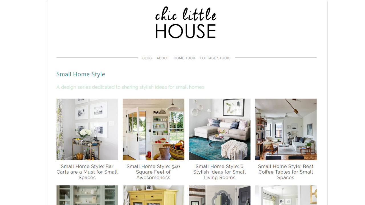
In Square Space, I was able to set up a CLH Blog Index for my categories. Now each category on my blog has its own dedicated page. I was able design and select a layout of my category pages, so every page is consistent. Another plus, is that whenever I add a new blog post to a category, the page is automatically updated! Did I mention each page has its own direct URL! Below is a glimpse of how my CLH Index looks and here is a direct link to my Small Home Style category page: www.chiclittlehouse.com/smallhomestyle I also have the ability to add new pages and change the layout of my pages when I want to with ease, no HTML code required. Can I get a hallelujah.

Below is view of how the same page looks on my website. I'm able to add a title to my page, with a short description of what the page is about. I've set a grid of pictures up (notice they're all the same size) Below each picture is the title to my blog post, both the image and text will lead the reader to the blog post. I can also include an excerpt of my blog post, if I wanted to. I love how my category pages feel professional and helps showcase topics I'm passionate writing about. 

CLH Small Home Style Page

CLH Small Home Style Page

Here's a closer look at my category links, these links are of my landing page of my site and also in the side bar on my blog page. I can't even be to articulate how HUGE this is, and I love being able to do my updates myself vs. relying on someone. Plus each picture on my category list visually helps give my readers a glimpse on on what to expect.

CLH Categories

CLH Categories

FIVE. Freestanding Web Pages

As I mentioned above my blog has freestanding pages within my website that are not linked in my blog header. What does that mean? It means, I'm able to create entry pages for my readers. Here's an example. If you follow me on Instagram, I share when there's a new post on my blog. Instead of using my direct website link or a Bit.ly link to my blog post that will get stale in a few days, my IG link is www.chiclittlehouse.com/hello this is link specifically for my IG followers. It's a quick hello + intro for my readers, followed by my most recent blog posts, that readers can scroll through. On this page, I've also included a search option, plus category option to search. Here's a quick look at my IG landing page.

SIX. Easily Integrates with Social Media, Especially Pinterest

Square Space makes it so simple to link your Social Media on your blog and throughout your website. For instance, I have my Social Media icons on my blog side bar, and in my blog footer, your able to choose the design and style and insert the links to your SM pages and bam it's done, again no code required. 

One of the most beneficial aspects of using SS, is the ability to seamlessly integrate with Pinterest and create 'Rich Pins'  What is a Rich Pin? Rich Pins, include extra information of the image you pin, including the website (source it came from), including a brief sentence from the website about the image. If your a small business owner / blogger enabling Rich Pins for your site is a must. 

SEVEN. Square Space Hacks & Support

Even though you don't need know HTML codes to make design changes in Square Space, you can inject code and make #SquareSpaceHacks further customizing the look and style of your blog. Lauren of Elle & Company shares several design hacks you can use in Square Space. Another great resource for hacks, are from my friend Lauren of Color Hug, she shares lots ideas on using Square Space  more effectively to grow your brand. I've also found lots of help and great how to videos on Square Space support page. 

EIGHT. Compatibility Modes

More and more blog readers are using their mobile devices: Phones and iPads / Tablets to read blog posts and its always a good idea to know how pages look for the various devices, not just on your computer screen. 

NINE. Create Custom Footer

All the years, I was on the Blogger platform, I never properly used my blog footer. In fact, I just ignored it. Now that I'm on Square Space, I treat my blog footer as a call to action. Meaning , I share with my readers publications Chic Little House has been featured in, along with another way to follow me and scope out some design inspiration. In addition my blog footer also includes my Social Media Icons. 

Whoa, that was a long post! If your thinking of making the switch from your current platform to Square Space do your homework and see if they switch is from you. It was fun to share my reasons I'm so happy I moved my blog, I've learned so much this year and learned to streamline my blogging process and keep my behind the scenes blogging organized. I do pay a small monthly fee to host my website, verses on Blogger I just paid for my website domain name once a year. But, if blogging is your business, hosting your website is business expense, but I'm not an accountant, so don't quote me on that! Feel free to ask any questions you may have about Square Space.